Step by Step Guide to an Advanced User Experience (UX) Audit
- David Martin
- Mar 26, 2019
- 5 min read
Updated: Apr 3
User Experience (UX) audits are used to give a business’s stakeholders a comprehensive overview of the quality and stability of any of their digital properties. While designers may have the best of intentions when working on a website, they often fall short of having all of the necessary data needed to make informed decisions. A UX audit removes conjecture by identifying what works, what doesn’t, and what may be missing so that designers can focus on fixing the right things. Here at FTF, we've developed a process to identify, document and prioritize issues on a website (or app) that could negatively impact the visitor's experience, resulting in lower conversions and lower quality leads/customers. UX audit process overview:
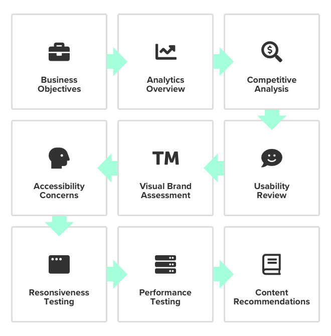
1. Establish Business goals and objectives
Before we can start analyzing any digital property, we first need to get to know a little more about the business. This may be accomplished in an onboarding survey or through stakeholder interviews, but the idea is to ask questions that will help our strategist understand the business, their revenue model and what outcomes are expected from the UX Audit.
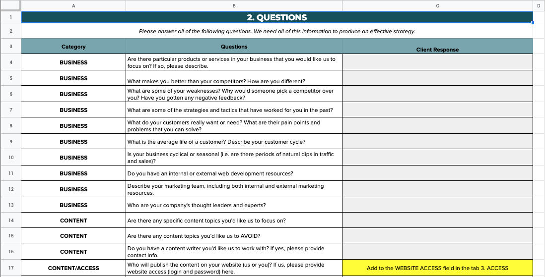
Some example questions from our survey:
What are some actions you expect users to be able to take on the site?
What are your primary sales channels?
What is the average life of a customer? Describe your customer cycle.
What are some of your values as a company? Strengths? Weaknesses?
Who are some of your biggest perceived competitors or major players in your market?
What are some of the challenges you’re having with converting online leads?
2. Review Analytics data, conversion metrics, and sales data
With the business objectives, we can analyze the data by pulling from search, social, sales, and any other relevant sources.
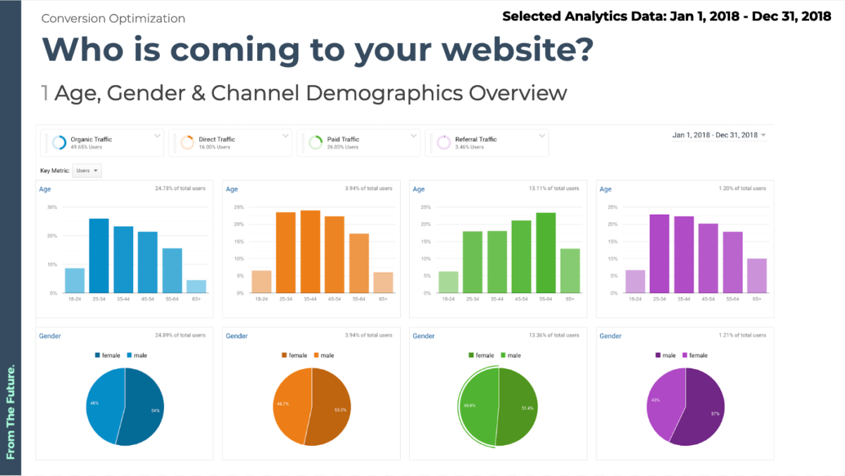
The goal here is to see what story all of the data is trying to tell us about who are users are, what they’re looking for, and why they may not be converting as expected.
In some cases, clients have additional data available which gets reviewed during this step as well. This includes:
heatmaps
scrollmaps
visitor recordings
funnel/form analytics
polls/feedback
user testing results
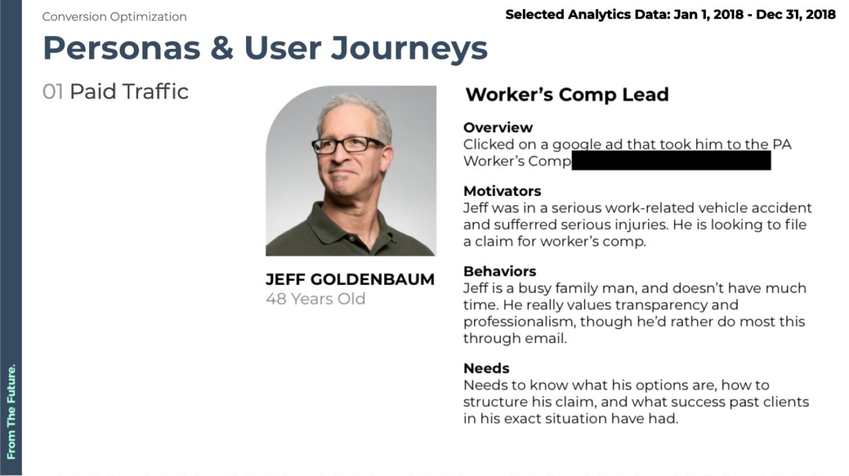
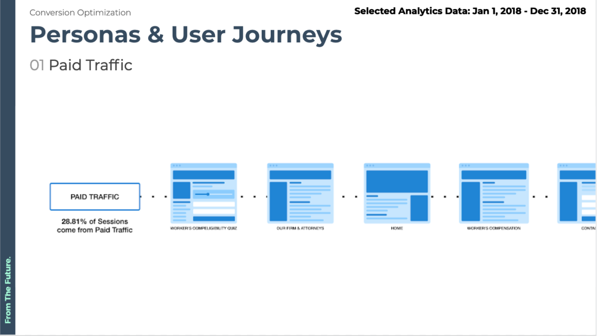
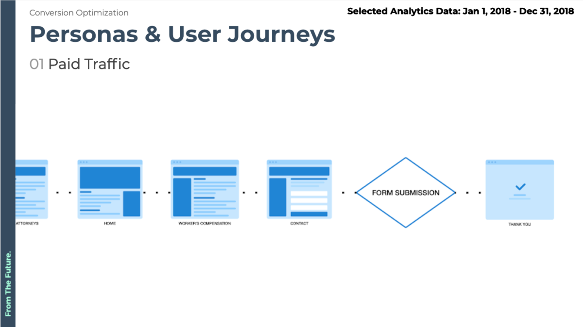
All of this data is used to create user personas and journeys to help our team (and your stakeholders) understand who their customers actually are and what their intent may be.
3. Execute a Competitive Analysis to identify successful design trends in the industry
Just looking at your website or app isn’t enough to make an informed decision on how to improve conversions.
That’s why we look at both direct and indirect competitors, their traffic, rankings and their website’s usability - to help us see how the client’s website stacks up.
Our competitive analysis is used to build a clear picture of what expectations users have when interacting with competitors - allowing us to suggest improvements that these competitors are missing or alternatively leveraging to great success.
4. Document shortcomings or frustrations with the existing UX
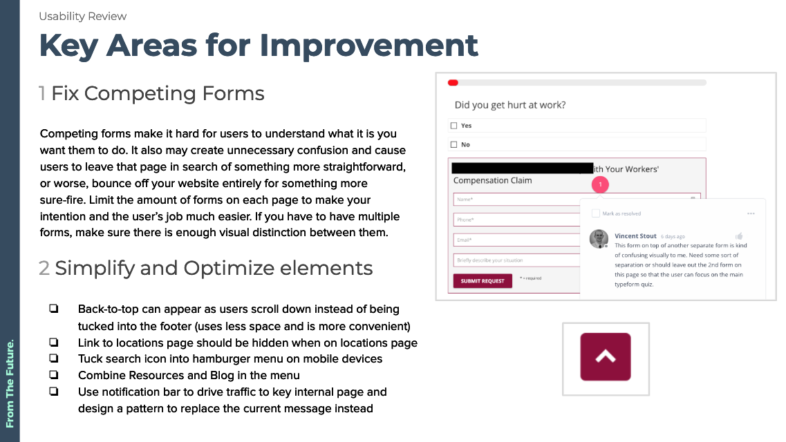
In this step, we conduct a screen-by-screen analysis of your website or app - paying close attention to any critical usability issues that may be hurting conversions.
We also map out the entire user flow for the website so we can identify all of the different pages and actions that users can take from anywhere on the site.
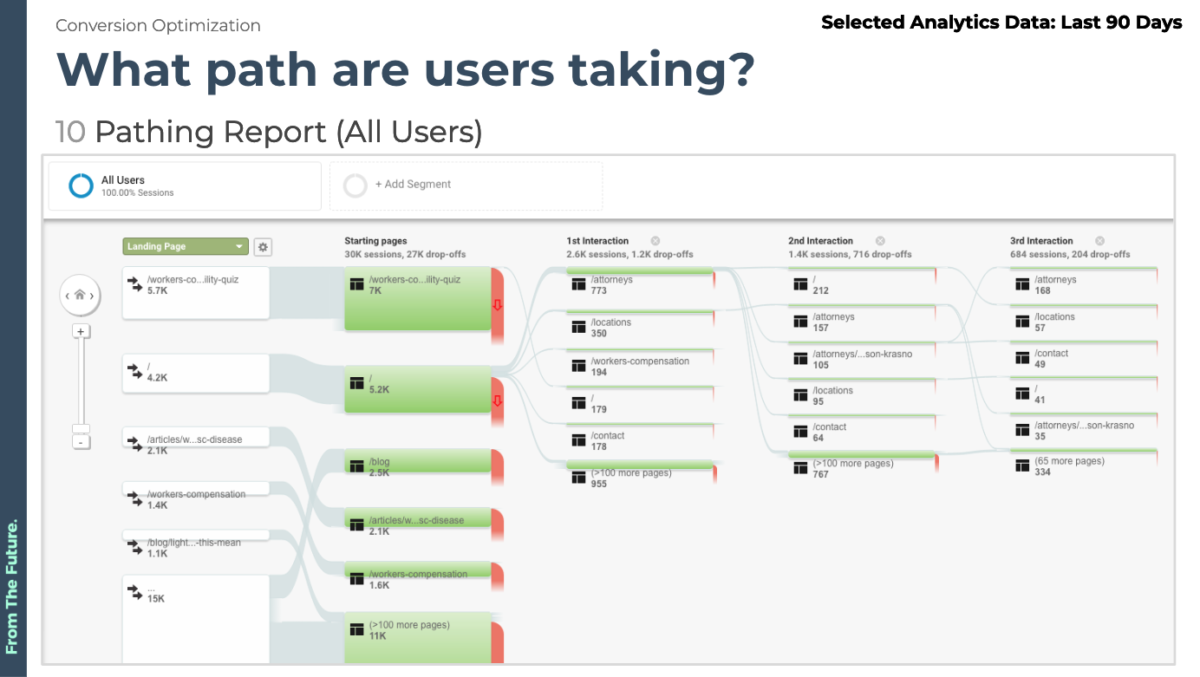
Using some of the reports mentioned in step 2 we’re able to look at what pages/posts are performing well, and which ones have abnormally large exit rates.
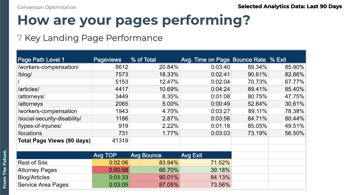
During this step, we also document quick wins, a/b test suggestions, and any glaring usability issues that may warrant immediate action.
5. Find inconsistencies or possible improvements in the Visual Design
Next, we hand over the findings to our design team and sr. strategists who run a visual brand assessment.
In it, we look at how we can boost website conversions by improving brand visibility and consistency on the site.
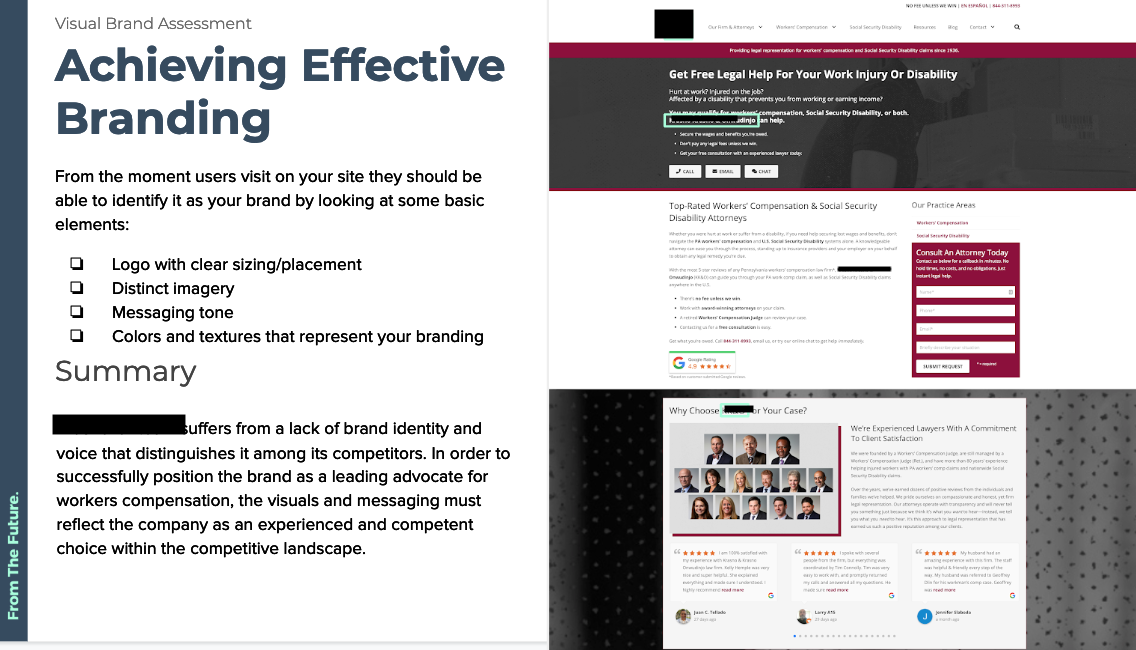
Is the logo clear and easy to find?
Is the messaging and tone appropriate for your audience?
Are the colors, textures, and fonts representative of your branding?
If the answer to any of these questions is no it means it may be time to finally invest in some brand guidelines or a design system.
6. Identify Accessibility concerns and remediation steps
Currently, around 10% of the world’s population (roughly 650 million people) live with a disability.
While the internet is by no means a new tool for most of us, companies have been slow to adopt website accessibility standards.
The goal of web accessibility is to make sure all people, including those with disabilities, have equal use of a website and it’s content.
This means that your website needs to be accessible to everyone, whether they’re colorblind, deaf, blind or learning impaired.
What’s even more important is that it’s actually legally required for companies to make sure that their website is accessible, otherwise it could lead to a lawsuit in many countries, including the United States (Section 508 Amendment to the Rehabilitation Act of 1973 - filed 1998).
In recent years, courts have often sided with users, who (rightly so), claim that not being able to use a website or app due to their disability is negatively affecting their lives.
In order to identify any major accessibility issues, we use automated accessibility testing tools and reports like Google’s lighthouse in order to identify major problem areas that may be infringing on expected web accessibility standards.
7. Run general Responsiveness testing and compile feedback
Nowadays users expect websites to look good on any and all devices, whether they’re reading it on an old mobile phone or a brand new desktop computer.
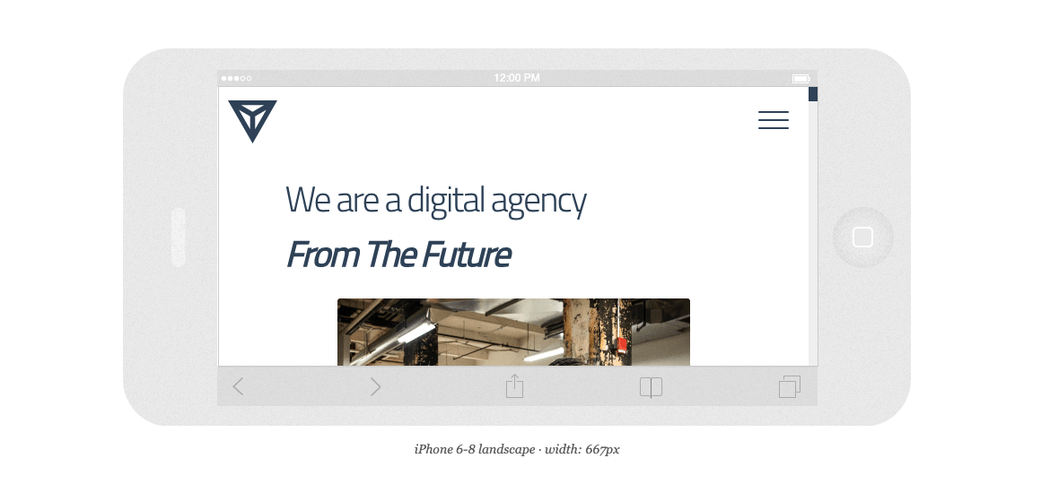
We’ll review and scrutinize all major page templates to identify any patterns that may not translate well on other devices, taking care to optimize not just for mobile and tablet but also larger displays, mostly based on available user data collected.
With the advent of css “frameworks” like Twitter’s Bootstrap and Google’s Material Design websites have started to adopt grid layouts which make it much easier for developers to adhere to general responsiveness standards users have come to expect.
8. Measure website Performance and suggest technical improvements
A website’s performance is a key indicator of the overall health of the site.
Slow websites don’t get much traffic, have difficulty retaining users, and they lead to abnormally large bounces and exit rates.
Users getting frustrated is only half of the problem - since Google takes into account a website’s speed when ranking pages, that means that slower speeds result in a lower overall ranking.
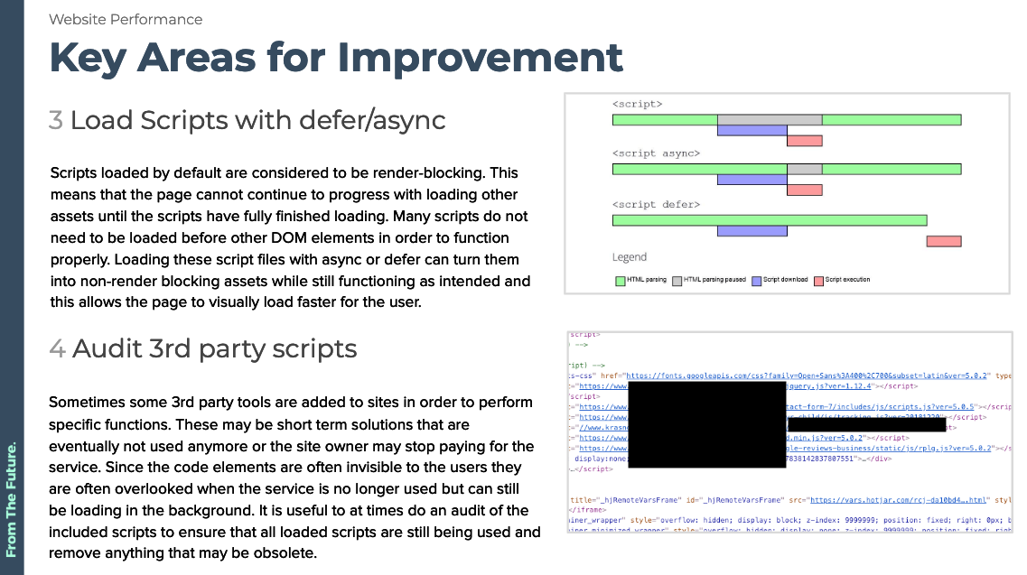
Making sure the user has a good experience means ensuring the website loads quickly, images are compressed and lazy loaded wherever possible, CSS and Javascript files are minified, and any unnecessary scripts/plugins are removed.
These minor speed optimizations can quickly add up and result in better load times, improved rankings, and improved retention site-wide.
9. Spot any possible issues with Content to improve message clarity
After the UX and Visual Design reviews are done we’re ready to start reviewing the content on the site.
This means reviewing all of the text, headings, subheadings, microcopy, and body text - while we may not go in to read every individual blog post, we make sure to utilize any relevant analytics data to identify low performing landing pages and posts that should be converting at a much higher rate.
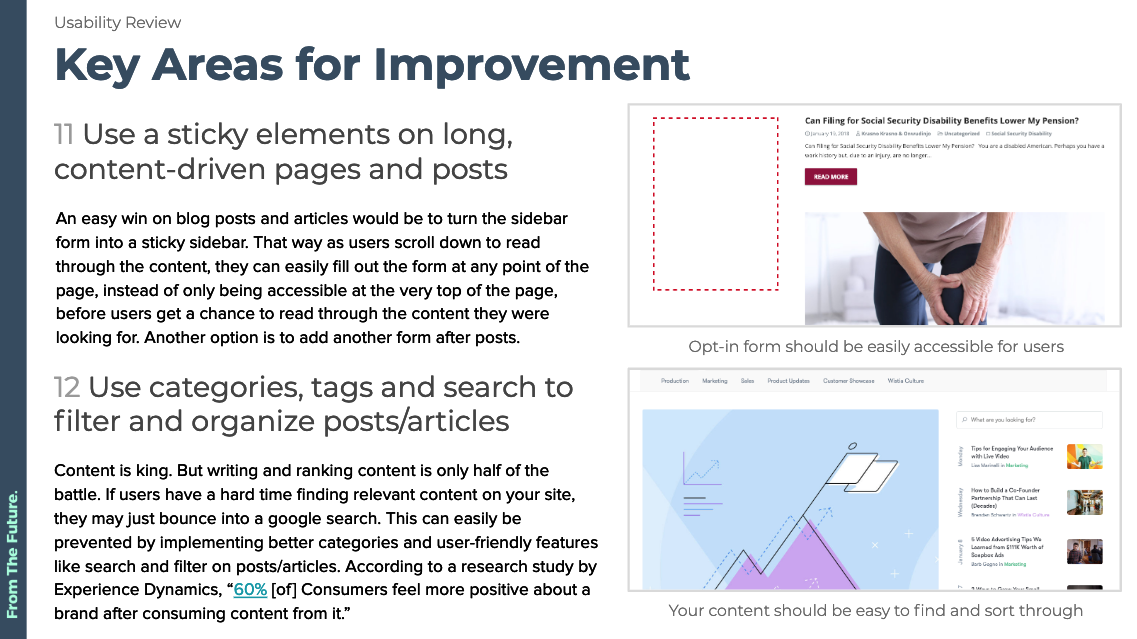
All major issues are documented and added to the list of potential updates suggested at the end of the audit, which often includes common problems like having large chunks of text, ambiguous headlines or buttons, and even confusing or missing instructional text.
10. Compile Results, identify quick wins and high impact items
The last step of the UX audit is to compile and synthesize findings for our clients - this includes any critical usability issues, quick wins, and A/B test suggestions.
This list is broken down by impact and difficulty, allowing us to identify what areas of improvement will result in the best ROI for clients based on their specific timeline and budget.
Questions?
If your website needs help to improve conversions, usability and on site engagement, drop us a line. Our team is standing by to help your website grow.
