UX: The New SEO Ranking Factor
- Nick Eubanks
- Jul 31, 2018
- 8 min read
Updated: Apr 3
We’ve worked on over a hundred SEO campaigns this year. This gives us access to a ton of valuable data that helps us understand what works (and what doesn’t).
Particularly, when you’ve exhausted all traditional SEO options (on-page improvements, link building, etc.) but still can’t get your website to move past a certain position - chances are it’s poor user experience that’s holding you back.
That doesn't have to be the case. User experience issues can be difficult to diagnose if you're used to breaking down your site from a more traditional SEO perspective.
What is UX and why it’s so critical to SEO
How to develop your audience to baseline your site’s UX
Implementing UX into your current SEO campaign
Let’s get into it.
Webinar
What is UX?
UX = user experience. This is not to be confused with UI (user interface).
UX is a function of marketing while UI is a function of design. UI and UX go hand-in-hand, but UX should be considered first.
User flows and visitor journeys
Mobile vs desktop layouts
Site structure and architecture
Fonts
Colors and patterns
Front end design styles (material, flat, photo realistic, etc)
Our UX team is made up of marketers with a good eye for design, while our UI team is made up of creatives who we’ve trained in marketing.

Why does UX matter for SEO?
Google’s algorithm is looking heavily at searcher satisfaction.
Google has done a tremendous job over the last 2 to 3 years of getting away from ranking signals that can be spammed easily (links, keyword stuffing, etc.). “Searcher satisfaction” is one of those new signals that is difficult to fake, as it looks at how a searcher responds to a Google result they’ve clicked on.
Did the searcher bounce right away?
Did the searcher complete an action on the site?
Did the searcher share the link on social media?
These are quality indicators to Google’s algorithm that determine whether the search result matched up with what the searcher was looking for. This action can only happen when a page gets clicks, which is only really likely if it's on the first or second page of Google results.
UX helps to increase "stickiness" of a page and increase user sentiment.
Delivering the perfect online experience is what makes a visitor “stick” and not bounce. That “stickiness” sends the right quality signals back to Google and indicates that your website is the right result for a given search query. Our data is showing us that “stickiness” (i.e. UX) is often the difference between positions 1 and 2.
UX is driven by a deep understanding of your audience
“Audience” understanding is often glazed over by marketers, especially in search marketing. A lack of audience understanding will have you wasting resources chasing people who do not contribute to your growth.
Your audience should feed your website’s UX - you should want to build everything in a way that it caters to your paying customers (colors, layouts, messaging, etc.).
Let's take a look at case studies to illustrate this point.
Example 1 - WEBRIS
I launched WEBRIS agency (now owned by FTF) in 2016 and pushed content hard to drive leads. While the agency was growing, the number of leads we were generating was not proportional to the amount of traffic, video views and overall attention received.
We turned to our data for some answers, and what we found was very interesting.
60,000 monthly website visitors
40,000 monthly video views
10 monthly MQLs
In short, 99.9% of our audience was
.

We dug further into our data to get more insights about our audience and realized 2 things:
90% of traffic was on desktop. Most people in today's world build their websites around mobile. But if your customer isn't a mobile user, then focus less on the experience for mobile users and cater all your resources around the user experience for desktop visitors.
My audience was almost all marketing professionals. They were not customers looking for agency services, they were marketers looking for advice and help on advanced topics.
This might sound basic, but it was an mini-epiphany for me.
Launched more offerings (tools and trainings) for marketing professionals.
Rebuilt the website with desktop-first designs, and added a clear sidebar navigation.
Refocused messaging and content to focus on advanced marketing problems - no more beginner content.

Almost
, we saw a massive increase in engagement.

Google noticed, too. The increases in "stickiness" of the site helped to push up a lot of keyword rankings to the top of the SERPs.
This simple change helped us to better nurture our traffic and awareness into paying customers.

A better understanding of our audience helped us tailor our online experience to it, which in turn fueled our growth.
Example 2 - Fetch My Vet
Fetch My Vet is a startup that provides in-home veterinary care for your pets (the "Uber for vets").
They hired us to help build an end-to-end digital strategy for their online brand.

Here's some things we looked at:
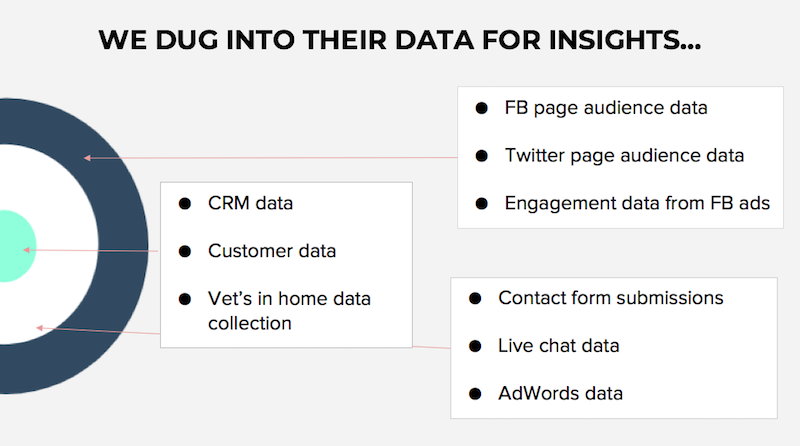
The outer ring (awareness: FB, Twitter and engagement data) to dig out an audience persona
The middle ring (fans: contact form submissions, live chat and Adwords data) to understand who is engaging with them
The inner ring (customer profile: CRM, customer, and in-home data) to understand who was at each stage in the journey for these customers
We discovered their current strategy was built around who they
their audience to be, as opposed to who
made up their audience. Their entire online experience reflected this - layouts, messaging, branding, etc. Everything was speaking to the wrong audience.
Our strategy was built around redefining their audience based on their data and rebuilding their entire online experience to reflect this.
Almost immediately, the company's trajectory changed. They're now finding the right customers at a much lower acquisition cost.
Example 3 - Ryan Stewart Consulting
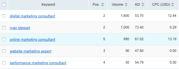
I've been a marketing consultant for over 10 years and use a personal site to generate leads. The site was ranking well for purchase intent keywords like "digital marketing consultant", but it was stuck on the second page of Google results. I tried everything to crack the first page - link outreach, "on-page" optimization, internal links and more. Nothing helped. When I took an objective look at the site from the perspective of my customer,
. The site was more of online resume that boasted about how great I
I was, and it didn't speak to my audience (someone looking for a marketing consultant).

The results were astonishing,
And most importantly, we cracked the first page (nationally) for keywords like
.
Now that we've talked about audience, let's talk about...
How to implement UX into an SEO campaign
The importance of UX in SEO is important, so we developed a process to implement UX best practices into client campaigns.
At a high level, this process includes:
Keyword research and mapping
URL architecture, hub and spoke models and user flows
Practical user conversations
I'm going to run you through client examples for each step of this process.
Step 1: Keyword Research and Mapping
Your website needs to deliver the right experience for the keywords you're targeting. This begins with
and ends with
those keywords.
Let's run through an example from an eCommerce client that sells shoelaces for sneakers.
I like to start by Googling my "main" keywords and using "Related Searches" to dig in deeper. This helps me understand what else people are searching for, in relation to my root keywords.
Below are the related searches for the keyword "shoelaces":

From this, I can deduce:
People are looking for shoelaces by shape (flat, round)
Since the website sold both flat and round shoelaces, it made sense to dive a little deeper into "round shoelaces".

From this, I can deduce:
People are modifying this search by color
People are modifying this search by function
Now, let's dive deeper into "round athletic shoelaces" and see what happens.

From this, I can deduce:
People are modifying this search by sizing
People are modifying this search by brand
This is a simple process that should be repeated for every page on your website. It helps you paint a picture of what the searchers are looking for, and gives you a base to build your pages around.
Each product page was built around brand, color, sizing and shape.

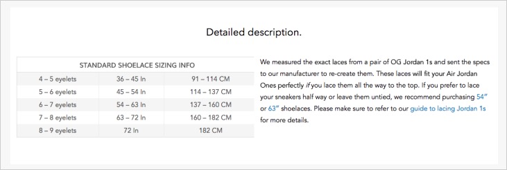
We designed HTML tables to speak specifically to sizing information.

And then we added a section with images to speak to the compatibility of the laces with difference sneaker brands.

The results speak for themselves:
The site was optimized from the start and dominated the SERPs.

Step 2: URL architecture, hub & spoke, user flows
If you want to rank for big, competitive keywords, you need a deep, supportive user experience.
We build this out using a "hub" and "spoke" content / architecture model in these competitive spaces.
A "hub" is the central topic you're targeting
"Spokes" are related topics that directly support your hub
Let's look at an example from a client campaign, Sandals Resorts.
Sandals tasked us with ranking them on top for "all inclusive resorts", a keyword with monthly search volume just over 200,000.
To rank for a keyword this competitive, it's not enough to just launch a single landing page. You need to build an architecture that supports it.

If someone is looking for the keyword "all inclusive resorts", they're probably also interested in things like accommodations, locations, activities, dining and so on.
Websites need to support this using a "hub" and "spoke" architecture. For Sandals, we built dozens of additional landing pages that supported the "hub" topic, which linked down to each "spoke" page.

The "spoke" pages provided supporting content about various "all inclusive" locations, dining experiences, romantic getaways and room accommodations.

We also bolstered the page with captivating imagery to help tell the story and increase dwell time by adding interactive features like slideshows and multimedia.

Basically, the page was rebuilt for consumption. Our data tells us that people skim pages, so we used features like bolded text to help highlight the main points and push people down the page to consume more content.
Again, the results speak for themselves.

The re-UX of the all inclusive resorts page pushed Sandals up to the top position for that term.
Step 3: Practical User Conversations
A lot of UX can be boiled down to practical decisions. Through conversations with your team and customers you can figure out what the optimal experience is. If you don't have access to a team or customer data, you can simply put yourself in your customer's shoes. Ask this question at every turn:
Pop-ups SUCK. They're annoying and ruin user sentiment.
Yet, marketers everywhere still use them.

Why?
"Because they work".
They also work at ensuring people leave your website and never return, crushing your site's "dwell time".
On WEBRIS, we switched from using pop-ups to a custom slider that stays completely out of the page's way and doesn't impede experience.

The switch not only increased time on site, but conversion rate as well.

The slider was converting at 7% compared to the pop-up at 3%.
If I was a visitor, would this page suffice my needs?
This logic was applied to Laces Out and Sandals Resorts heavily, but those were sales pages. I'd imagine you've already asked yourself the same question about your sales pages.
I like to use Ahrefs to find pages on a site that have keywords stuck between positions 7 to 20. These are "low-hanging fruit" that, with improvement, can make the jump to to the first page.
A while back we found a post on WEBRIS about "free SEO tools" that was on the verge of gaining some big-time traffic.

The page had good content and links, but terrible UX. We added filters to the post, images and improved design.

Within a few weeks, keyword rankings improved.

We didn't add any more content or build new links - we simply rebuilt the frontend to make it "stickier."
Good content + stickiness = rankings.
UX is Underrated (Make It Your Weapon)
Google's number 1 priority is searcher satisfaction. If your website's experience doesn't deliver the right experience, you're going to have a tough time getting organic exposure.
Understand your audience and use your website to communicate.
Improve your website's experience and the rankings will follow.
Or, just hire us to do it for you :grin:.


